
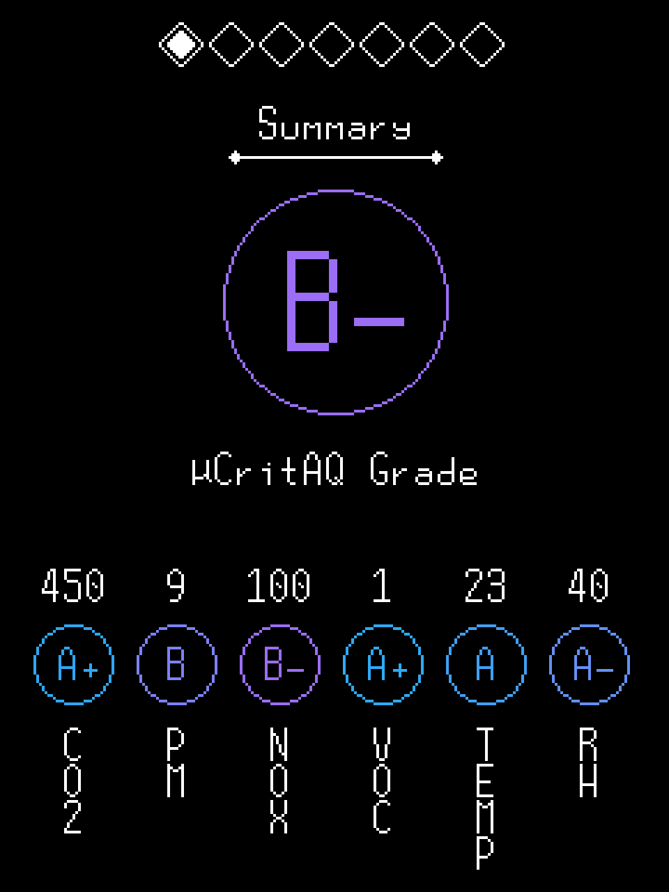
The largest element on this page is the player's aggregate air quality grade. It reflects the overall air quality at the moment. Beneath, smaller elements show grades for each of the main air quality metrics. Real measurements are thumbnailed above the grades.

Here, real measurements with units can be viewed for all main air quality metrics. Measurement text is coloured to represent relative badness. To the right of each measurement is an arrow indicating if that metric is currently trending up or down.

The sparklines on this page reach seven days into the past from present day. The plotted values correspond to grades, with grade goodness increasing along the Y axis. Below each sparkline is a readout of its maximum, mean, and minimum values. To change which metric is being dislayed, tap the sparkline viewport.


The calendar page, once opened, begins with date selection. When a date is selected, a graph of that date's logged air quality data is made available. The graph's cursor is moved with the D-pad. Zoom with A/B. Beneath the graph viewport, a readout of the hovered data is avaiable. To change which metric is being displayed, tap the graph viewport.
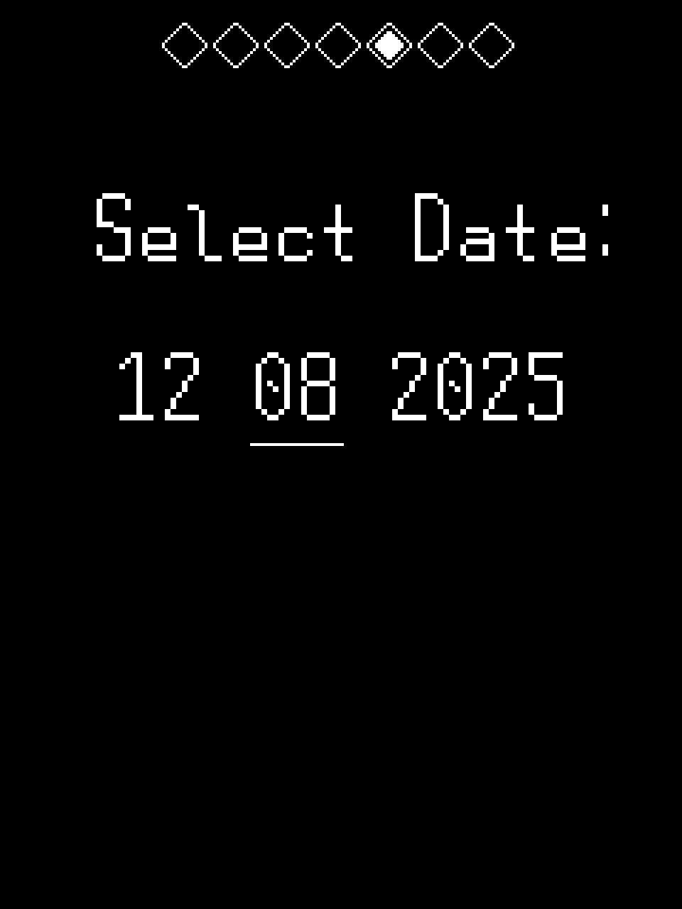

The ACH calculator, once opened, begins with date selection. When a date is selected, graphs of that date's logged CO2 and PN 10.0 data are made available in sequence. On each graph, you will be prompted to select a time range to be submitted for analysis. Once the time ranges are selected, e/ACH for each range will be calculated and combined into a Total ACH value.

Nothing more and nothing less than a clock.

This page must be passed through to get to the apartment or, in the case of a crisis, the crisis report. In the case that a crisis occurs, this page will be highlighted and will give an overview of the crisis' nature. If no crisis is underway and all is well, the highlight will disappear and the page will indicate nominal status.